10+ Top Gold Color Combinations for a Luxurious Home Interior
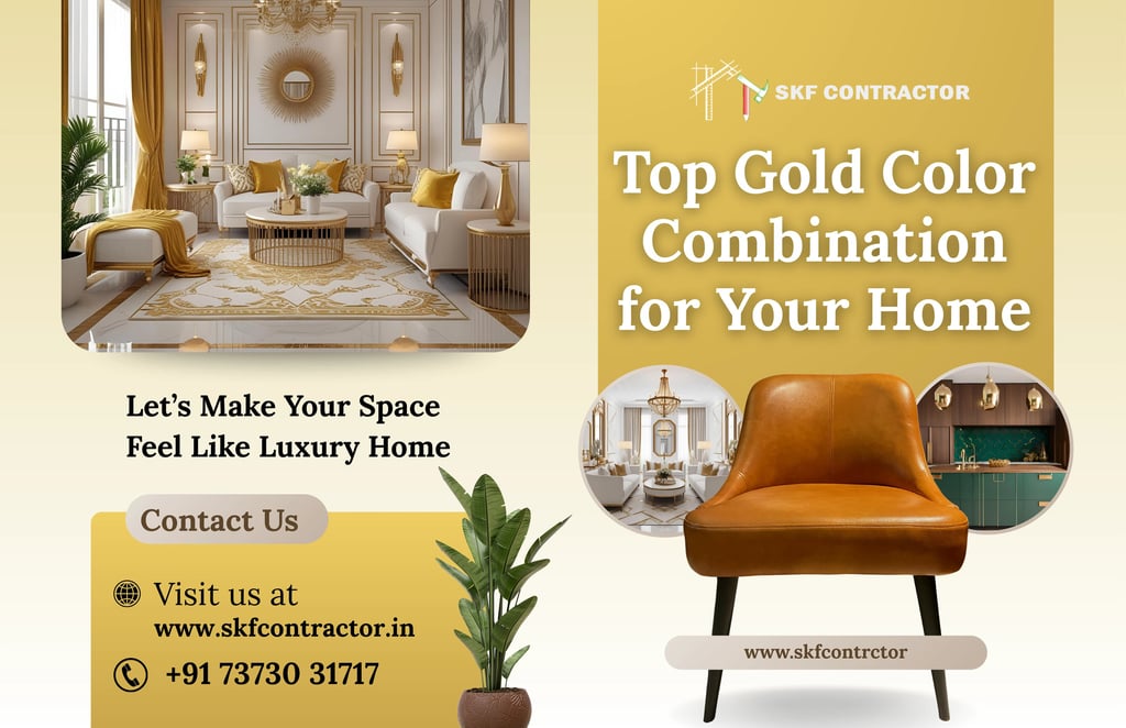
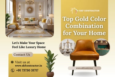
Top 10 Gold Color Combination for Your Home (Elegant, Modern & Timeless Ideas)
Color combination for gold plays a powerful role in defining the mood, richness, and personality of your home. Gold isn't just a color; it says something about warmth, style, and class. When used with the proper colors, gold can turn plain rooms into high-end living spaces that feel luxurious but not too much.
We will look at the top 10 gold color combinations for your home in this guide. We will also show you how to apply them in each area and help you pick the best one for your taste. This book can help you make the appropriate design choices, whether you're building a modern flat or a fancy villa.
Summary :-
Gold color combinations look best when they are balanced with soft neutrals, earthy tones, or dark colors that are very different from each other. When you mix gold with white, beige, navy blue, emerald green, or charcoal gray, it makes the room look more elegant without making it too busy. To get a high-end look for your home, you need to pick the proper textures, lighting, and finishes.
🟡 Why Gold is a Popular Interior Color Choice
Gold stands for wealth, warmth, and elegance. In interior design, it adds:
A luxurious touch
Visual depth and richness
A modern or royal aesthetic (depending on pairing)
Timeless appeal that never goes out of trend
Adding gold accents, wall colors, lighting, or furniture in little amounts will make any room feel better.
✅ Top 10 Gold Color Combination for Your Home
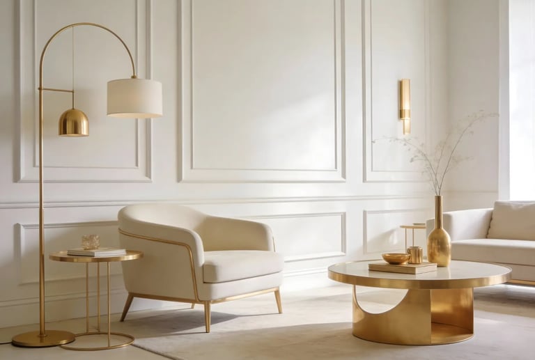
1. Gold and White – Timeless & Elegant


Best for: Living rooms, bedrooms, luxury apartments
One of the most popular color combinations is gold and white. White makes a clean background, and gold makes it look more elegant.
Where to use:
White walls with gold trims
Gold-framed mirrors
White furniture with gold handles
2. Gold and Beige – Soft & Premium
Beige softens the shine of gold, creating a warm and cozy environment.
Perfect for: Bedrooms and drawing rooms
Design tip: Use beige walls with gold décor pieces or lighting fixtures.
3. Gold and Grey – Modern & Stylish
Grey balances the brightness of gold and gives a modern, urban look.
Best areas: Living room, office space
Use case: Grey walls with gold accents or metallic decor
4. Gold and Navy Blue – Royal & Bold

This combination feels luxurious and dramatic.
Ideal for: Accent walls, master bedrooms
Tip: Add gold lighting or décor to balance dark blue tones.
5. Gold and Emerald Green – Rich & Classy

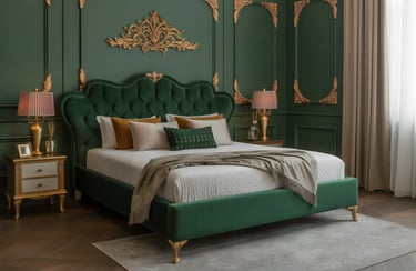
Green brings freshness while gold adds richness.
Best for: Feature walls, lounges
Design idea: Emerald green velvet sofa with gold legs or decor.
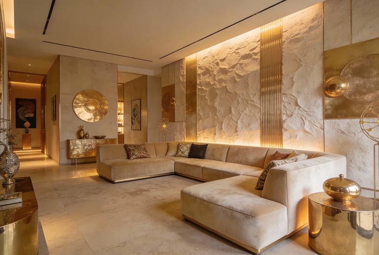
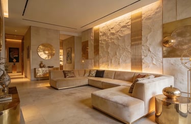
6. Gold and Black – Luxury at Its Peak
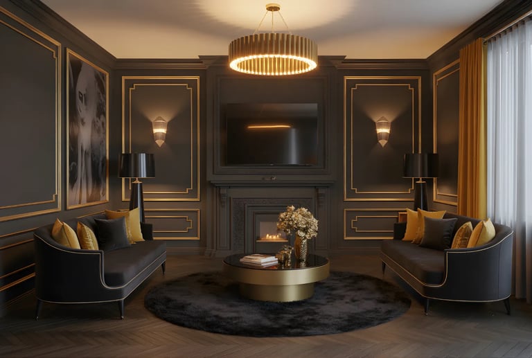
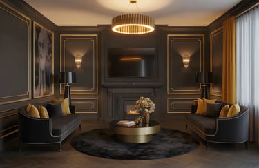
This bold combination speaks sophistication.
Best for: Modern apartments, luxury homes
Tip: Use black minimally to avoid overpowering the space.
7. Gold and Pastel Pink – Soft & Elegant
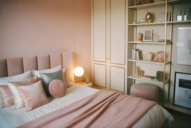
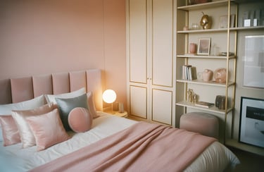
A perfect mix for contemporary and feminine interiors.
Best for: Bedrooms, dressing areas
Design idea: Blush pink walls with gold lamps or frames.
8. Gold and Teal – Vibrant & Artistic
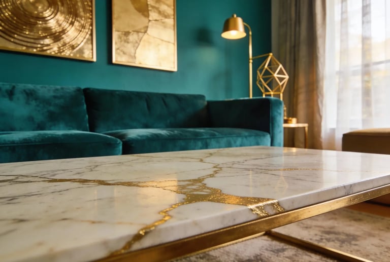
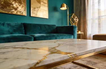
Teal adds creativity and energy while gold maintains elegance.
Best for: Accent walls, creative spaces
Tip: Use matte gold with glossy teal finishes.
9. Gold and Brown – Earthy & Warm
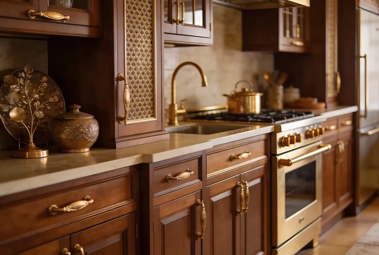
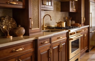
A natural and comforting combination.
Best for: Traditional homes, wooden interiors
Design tip: Wooden textures with gold highlights.
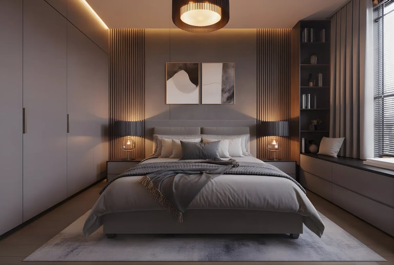
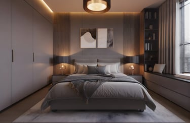
10. Gold and Ivory – Minimal & Luxurious
Ivory keeps things subtle while gold adds richness.
Best for: Minimalist interiors, luxury bedrooms
Tip: Use soft lighting to enhance elegance.
🏠 How to Use Gold Color in Different Spaces
Living Room
Gold accent walls
Metallic decor and lighting
Gold-trimmed furniture
Bedroom
Gold headboards
Soft gold wallpapers
Warm lighting fixtures
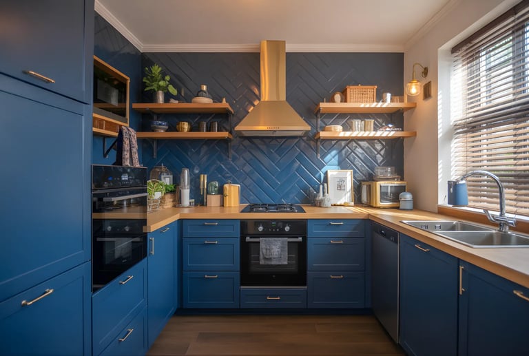
Kitchen
Gold cabinet handles
Gold backsplash details
Bathroom
Gold faucets and mirrors
White & gold tiles
Design Tips for Working with Gold
To ensure your color combination for gold looks professional and not overwhelming, follow these three rules:
Balance the Textures: If your gold is shiny (polished), keep your base color matte. If your base color is shiny (like silk or marble), use a brushed or antique gold finish.
The 60-30-10 Rule: 60% should be your primary color (e.g., White), 30% your secondary color (e.g., Grey), and 10% should be your gold accents.
Lighting Matters: Gold reflects light. Warm yellow lights will make gold look deeper and more "yellow," while cool white lights will make it look more like silver-gold.
📌 Common Mistakes to Avoid When Using Gold
Overusing gold (can look flashy)
Poor lighting selection
Mixing too many metallic shades
Ignoring balance with neutral tones
🚀 How SKF Contractor Can Help You Design the Perfect Gold-Themed Home
At SKF Contractor, we are experts at making beautiful, useful, and customized interior designs with the right color combination for gold and other high-end colors. Our skilled designers make sure that every room shows off luxury, comfort, and your taste, from the planning stage to the final execution.
We can help you with whatever kind of interior design you choose, whether it's a modern home, a royal-themed home, or a simple luxury design. We use high-quality materials, smart layouts, and skilled finishing, all within your budget.
Q1. Which color goes best with gold for home interiors?
White, beige, grey, navy blue, and green are the best colors that pair beautifully with gold.
Q2. Is gold color suitable for small homes?
Yes, when used in accents or light shades, gold enhances space without making it look heavy.
Q3. Can gold color be used in modern interiors?
Absolutely. Matte gold and brushed finishes look very modern and elegant.
Q4. What wall color goes best with gold furniture?
Neutral tones like white, beige, grey, or soft pastels work best.
Q5. Is gold a good choice for Indian homes?
Yes, gold blends well with Indian aesthetics and adds warmth and luxury.
FAQs on “Gold Color Combination ”
CONTACT US
C-158A, Street No.2, Chattarpur Enclave, Ph-2, 100ft Road New Delhi, Delhi 110074
+91 73730 31717
ADDRESS
SKF Contractor @2026 All Rights Reserved.
QUICK LINKS
Our Popular Services:
Interior Designer | Office Interior Design | Modular Kitchen | Living Room Interior Design | Bedroom Interior Design | Salon Interior Design | Jewellery Shop Interior Design | Showroom Interior Design | Apartment Interior Design | Home Interior Design | Commercial Interior Design | Villa Interior Design | Turnkey Interior Design | Kids Room Interior Design
Our Recent Projects:
Manish Bhasin's 2BHK | Puneet Agarwal's 3BHK | Parth Sarthi's 3BHK | Aarpit Jaiswal's 3BHKs | Bhawna Gupta's 2BHK | Amit Vaid's News Channel | Delta Export's Office | Avyukta Corporate Solution's
Our Service Locations:
Delhi:-
Interior Designer in Delhi | Interior Designer in South Delhi | Interior Designer in East Delhi | Interior Designer in Central Delhi | Interior Designer in Dwarka | Interior Designer in Dwarka Expressway | Interior Designer in Rohini | Interior Designer in Pitampura | Interior Designer in Janakpuri | Interior Designer in Vasant Kunj | Interior Designer in Saket | Interior Designer in Greater Kailash 1 | Interior Designer in Greater Kailash 2 | Interior Designer in South Extension | Interior Designer in Chattarpur | Interior Designer in Mayur Vihar | Interior Designer in Preet Vihar | Interior Designer in Punjabi Bagh | Interior Designer in Rajouri Garden | Interior Designer in Model Town | Interior Designer in Civil Lines | Interior Designer in Jasola | Interior Designer in Sarita Vihar | Interior Designer in Connaught Place | Interior Designer in Okhla |
Gurgaon / Gurugram:-
Interior Designer in Gurugram | Interior Designer in Sohna Road | Interior Designer in Manesar | Interior Designer in Golf Course Road | Interior Designer in Ambience Island | Interior Designer in DLF Phases | Interior Designer in DLF Phase 1 | Interior Designer in DLF Phase 2 | Interior Designer in DLF Phase 3 | Interior Designer in DLF Phase 4 | Interior Designer in DLF Phase 5 | Interior Designer in DLF the Camellias | Interior Designer in DLF the Magnolias | Interior Designer in Nirvana Country | Interior Designer in MG Road | Interior Designer in Gurgaon Sector 30 | Interior Designer in Gurgaon Sector 37D | Interior Designer in Gurgaon Sector 49 | Interior Designer in Gurgaon Sector 81
Faridabad:-
Interior Designer in Faridabad | Interior Designer in Green Fields | Interior Designer in Surajkund | Interior Designer in Faridabad Sector 9 | Interior Designer in Faridabad Sector 10 | Interior Designer in Faridabad Sector 15 | Interior Designer in Faridabad Sector 17 | Interior Designer in Faridabad Sector 19 | Interior Designer in Faridabad Sector 21C | Interior Designer in Faridabad Sector 28 | Interior Designer in Faridabad Sector 30 | Interior Designer in Faridabad Sector 31 | Interior Designer in Faridabad Sector 46
Ghaziabad:-
Interior Designer in Ghaziabad | Interior Designer in Indirapuram | Interior Designer in Vaishali | Interior Designer in Vasundhra | Interior Designer in Raj Nagar Extension | Interior Designer in Kavi Nagar | Interior Designer in Crossings Republik | Interior Designer in Shastri Nagar | Interior Designer in Nehru Nagar | Interior Designer in Kaushambi | Interior Designer in Sahibabad | Interior Designer in Mohan Nagar | Interior Designer in Lohia Nagar | Interior Designer in Govindpuram | Interior Designer in Lal Kuan | Interior Designer in Wave City
Noida:-
Interior Designer in Noida | Interior Designer in Noida Extension | Interior Designer in Noida Sector 18 | Interior Designer in Noida Sector 44 | Interior Designer in Noida Sector 62 | Interior Designer in Noida Sector 75 | Interior Designer in Noida Sector 76 | Interior Designer in Noida Sector 104 | Interior Designer in Noida Sector 128 | Interior Designer in Noida Sector 137 | Interior Designer in Noida Sector 142 | Interior Designer in Noida Sector 150
Greater Noida:-
Interior Designer in Greater Noida | Interior Designer in Pari Chowk | Interior Designer in Greater Noida West | Interior Designer in Alpha 1 | Interior Designer in Alpha 2 | Interior Designer in Beta 1 | Interior Designer in Beta 2 | Interior Designer in Gamma 1 | Interior Designer in Gamma 2 | Interior Designer in Delta 1 | Interior Designer in Delta 2 | Interior Designer in Omega 1 | Interior Designer in Omega 2 | Interior Designer in Zeta 1 | Interior Designer in Zeta 2 | Interior Designer in Greater Noida Sector 36 | Interior Designer in Knowledge Park 1 | Interior Designer in Knowledge Park 2 | Interior Designer in Knowledge Park 3 | Interior Designer in Knowledge Park 4 | Interior Designer in Techzone 4