Golden Colour Combination for Home: The Complete Room-by-Room Guide
There's a particular moment almost every homeowner has had. You're standing in front of a wall of paint swatches, or scrolling through a hundred Pinterest boards, and you land on a shade of gold that just feels right. And then the doubt creeps in — will it look regal, or will it look like a wedding hall? Will it clash with the sofa? Will it feel dated in two years?
If that sounds familiar, you're in exactly the right place. “Golden colour combination” happens to be one of the most searched interior design questions in India today — and after two decades of designing homes across Delhi NCR, we can tell you why: gold is one of the few colours that can go from subtle to spectacular depending purely on how it's paired. Used well, it turns an ordinary living room into something that feels considered and expensive. Used carelessly, it can overwhelm a space in a single afternoon of impulsive painting.
This guide is our attempt to answer every version of that question we get asked — in client meetings, on WhatsApp, in site visits — all in one place. We're going to walk through which colours actually pair well with gold, how that answer changes depending on the room, what finishes work best, the mistakes we see people make most often, and even how gold fits into Vaastu-conscious Indian homes. By the end, you should be able to look at a gold swatch and know exactly what to do with it.
Why Golden Colour Works So Well in Home Interiors
Gold occupies a strange and useful middle ground in the colour wheel. It's warm, like beige or terracotta, so it never feels cold or clinical the way some greys and blues can. But unlike a flat neutral, gold carries shimmer, depth, and a sense of occasion — it catches light differently through the day, which is part of why a golden wall can look completely different.
There's also a reason gold keeps resurfacing as a favourite among designers, year after year, instead of fading out like other trends. Homeowners have been moving away from stark, all-white minimalism and looking for interiors that feel warmer and more personal, without going fully maximalist. A gold accent — a mirror frame, a light fixture, a single feature wall — delivers exactly that kind of richness without requiring you to commit to a loud, busy colour scheme.
If there’s one principle that comes up in almost every project where we’ve used gold successfully, it’s this: gold should support the room, not compete with it. The moment you try to make gold and two other bold colours fight for attention in the same space, the room stops feeling luxurious and starts feeling chaotic. Keep that one idea in mind, and most of the decisions below become much easier.
ALSO READ : 7 Gold Colour Combinations for Home Decor
Which Colour Matches Best With Golden? (Quick Reference)
This is the single most-asked question we get, so let's slow down and actually talk through it before jumping room by room — because a quick list of names never really tells you why one combination works and another doesn't. Based on hundreds of projects across Delhi, Noida, Gurugram, Ghaziabad and Faridabad, here's how we actually think about it when a client asks us this.
09 Top Golden Colour Combinations
Gold + White or Off-White
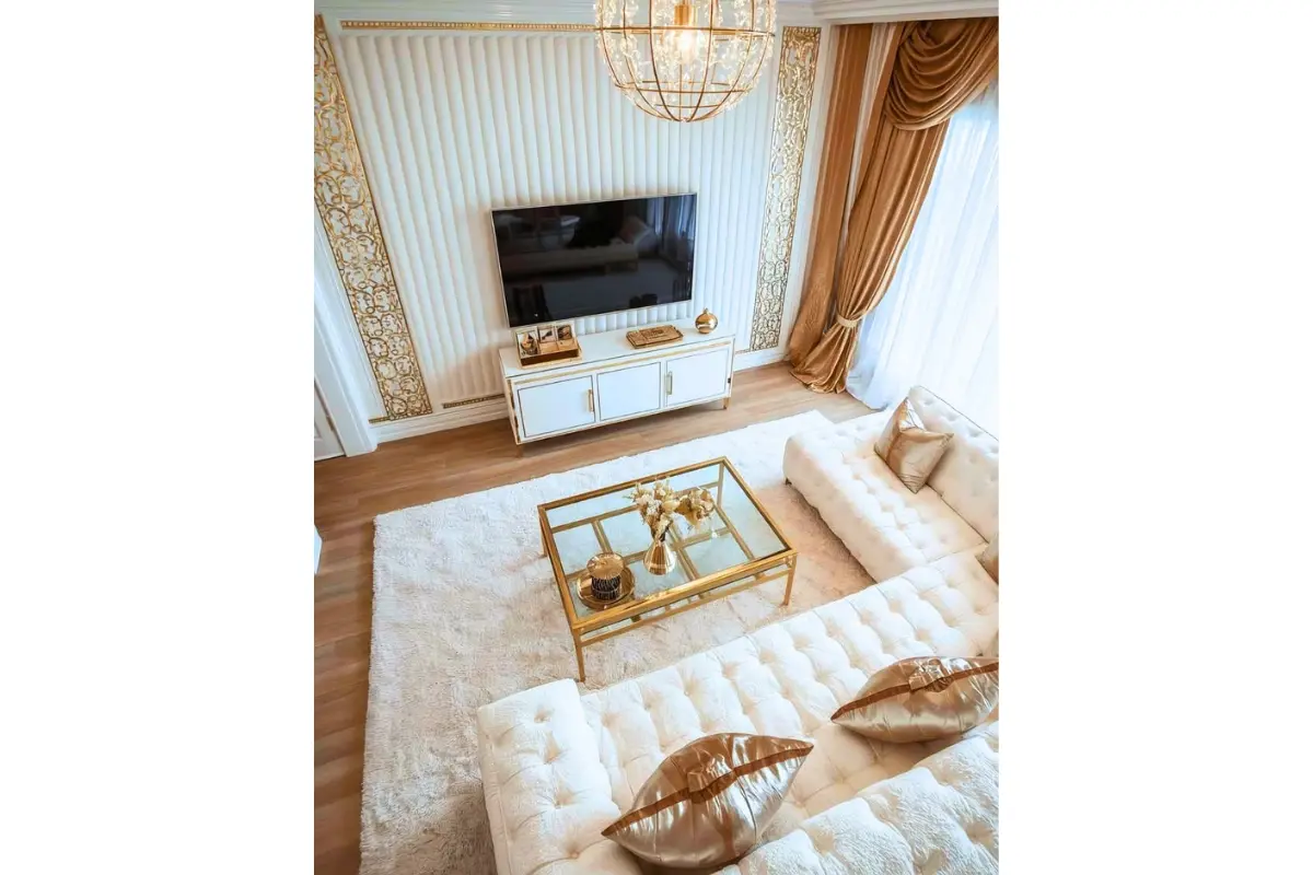
If you want something that is almost impossible to get wrong, start with white or off-white. It's the combination we fall back on more than any other, because it lets gold do all the talking without any risk of the room feeling heavy or over-decorated. It works in a tiny 1BHK just as well as it does in a sprawling villa, which is part of why it's such a safe first step if you're new to using gold at all.
Gold + Navy or Royal Blue
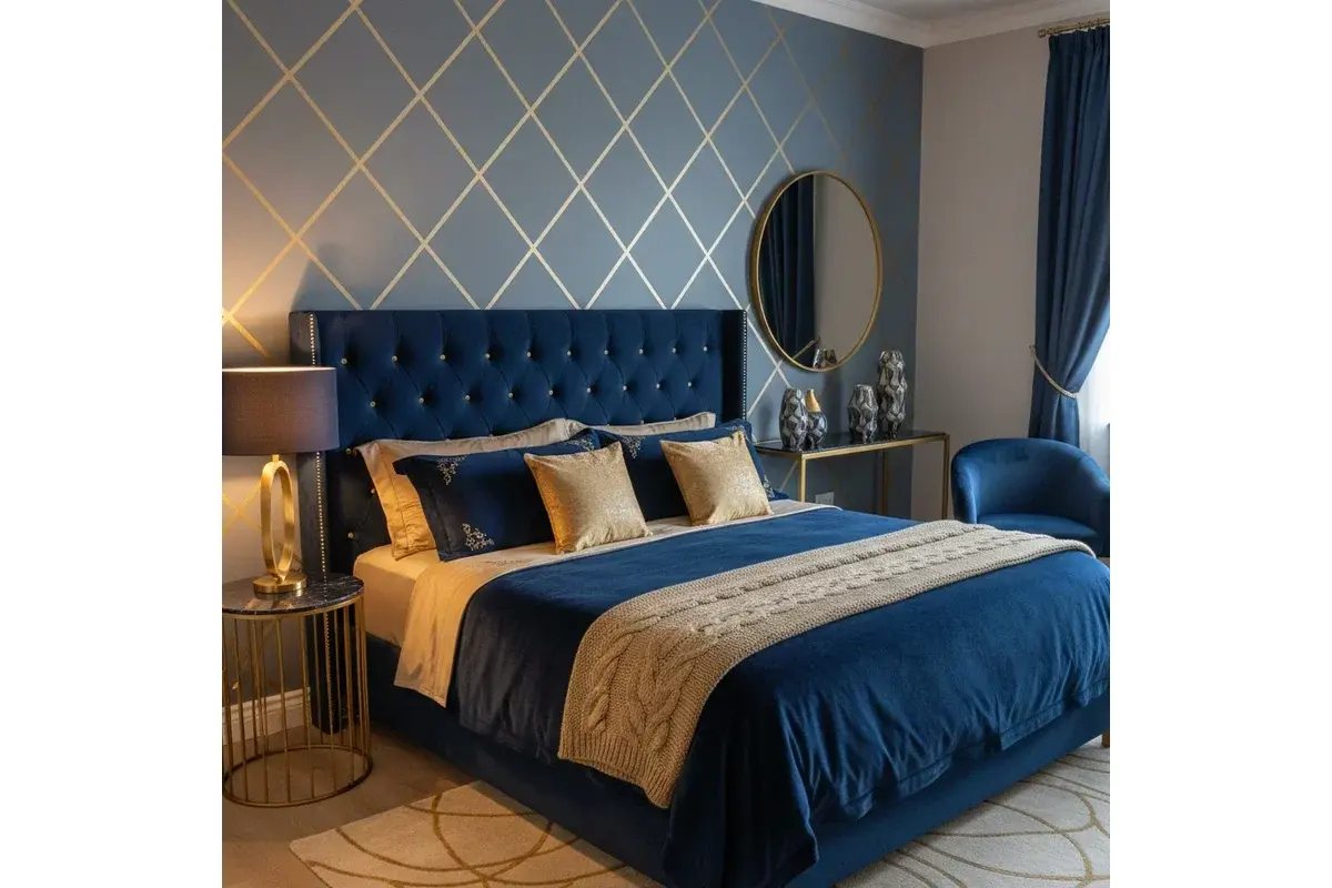
Once you're ready for something with a bit more personality, navy or royal blue is usually where we point clients next. There's something genuinely regal about the way gold sits against blue — lighter, softer blues give you an almost coastal, breezy elegance, while a deep navy leans more formal, almost palace-like. It's a combination that photographs beautifully and, in our experience, never really goes out of style, which matters if you're not planning to repaint every couple of years.
Gold + Deep Green (Emerald, Bottle Green, Olive)
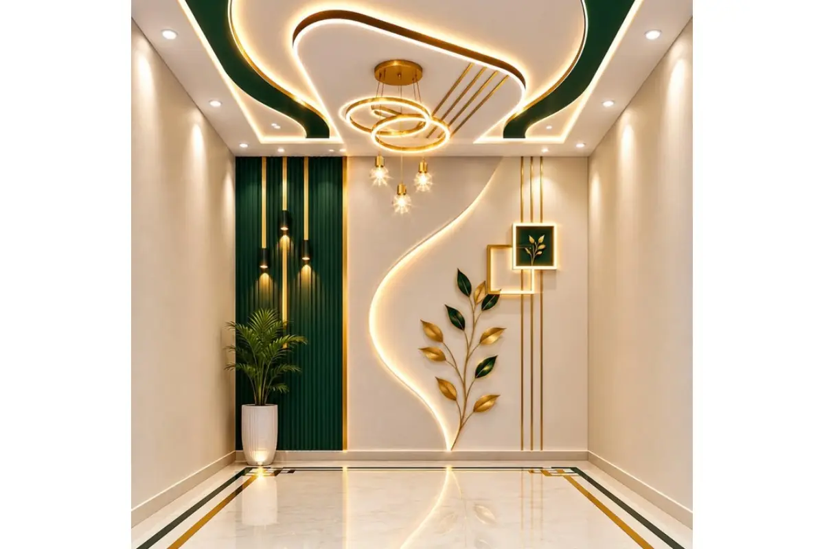
Deep green — emerald, bottle green, even a muted olive — is probably the combination we're getting asked for the most right now. It's having a real moment in interior design, but honestly, we'd recommend it even if it weren't trending, because green and gold together have this natural, almost botanical richness that just works. It pairs especially well with wooden furniture and brass fixtures, so if your home already leans warm and earthy, this is worth considering.
Gold + Grey (Charcoal or Dove Grey)
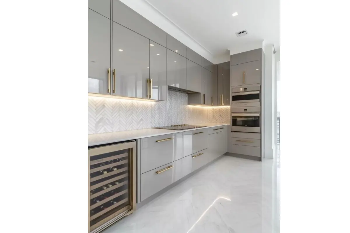
For clients who like the idea of gold but are a little nervous about it looking “too much,” we almost always steer the conversation toward grey. Charcoal grey gives the room a quiet sense of drama without shouting about it, while a softer dove grey keeps things calm and easy to live with day to day. Either way, grey lets gold add warmth to the space without pulling focus away from your furniture and the rest of your decor — it's a very forgiving combination.
Gold + Beige or Brown
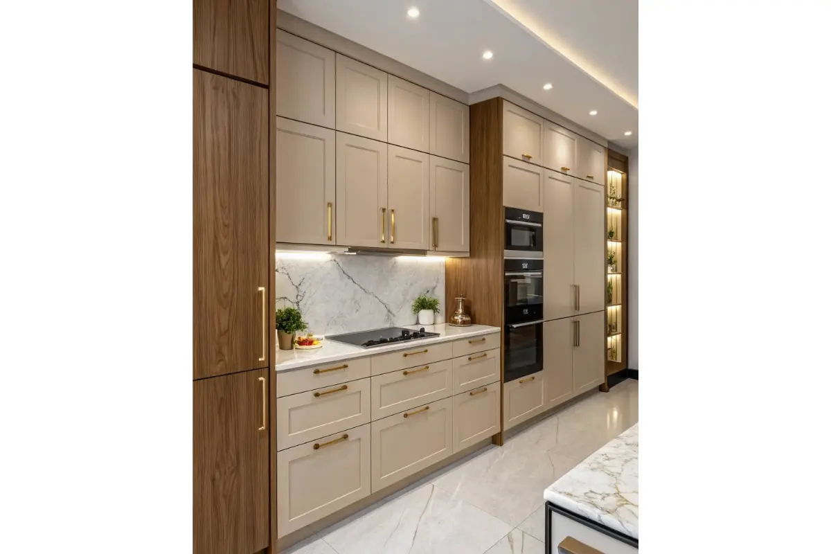
Beige and brown are the pairing we reach for most often when the goal is simply comfort — no drama, no statement, just a room that feels cosy and grounded. This is why it turns up so often in bedrooms and family spaces, where you want gold's warmth without anything competing for attention.
Gold + Black
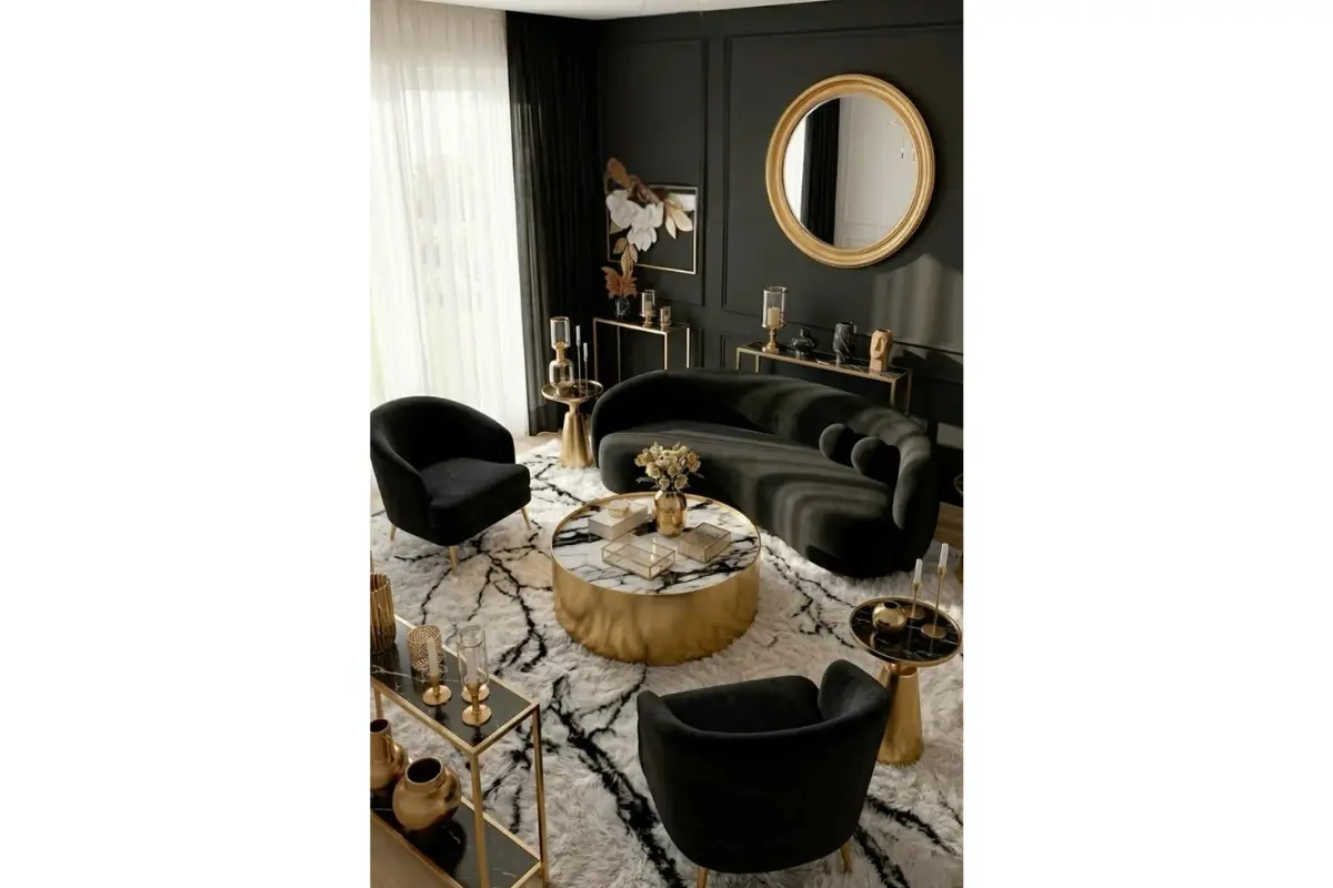
Black and gold, on the other hand, is where things get genuinely dramatic. It's a premium, high-impact combination, but it only works in small doses — a feature wall, a mandir, a statement powder bathroom — rather than an entire room. Cover too much of a space in it and it stops feeling luxurious and starts feeling like a nightclub.
Gold + Maroon or Wine
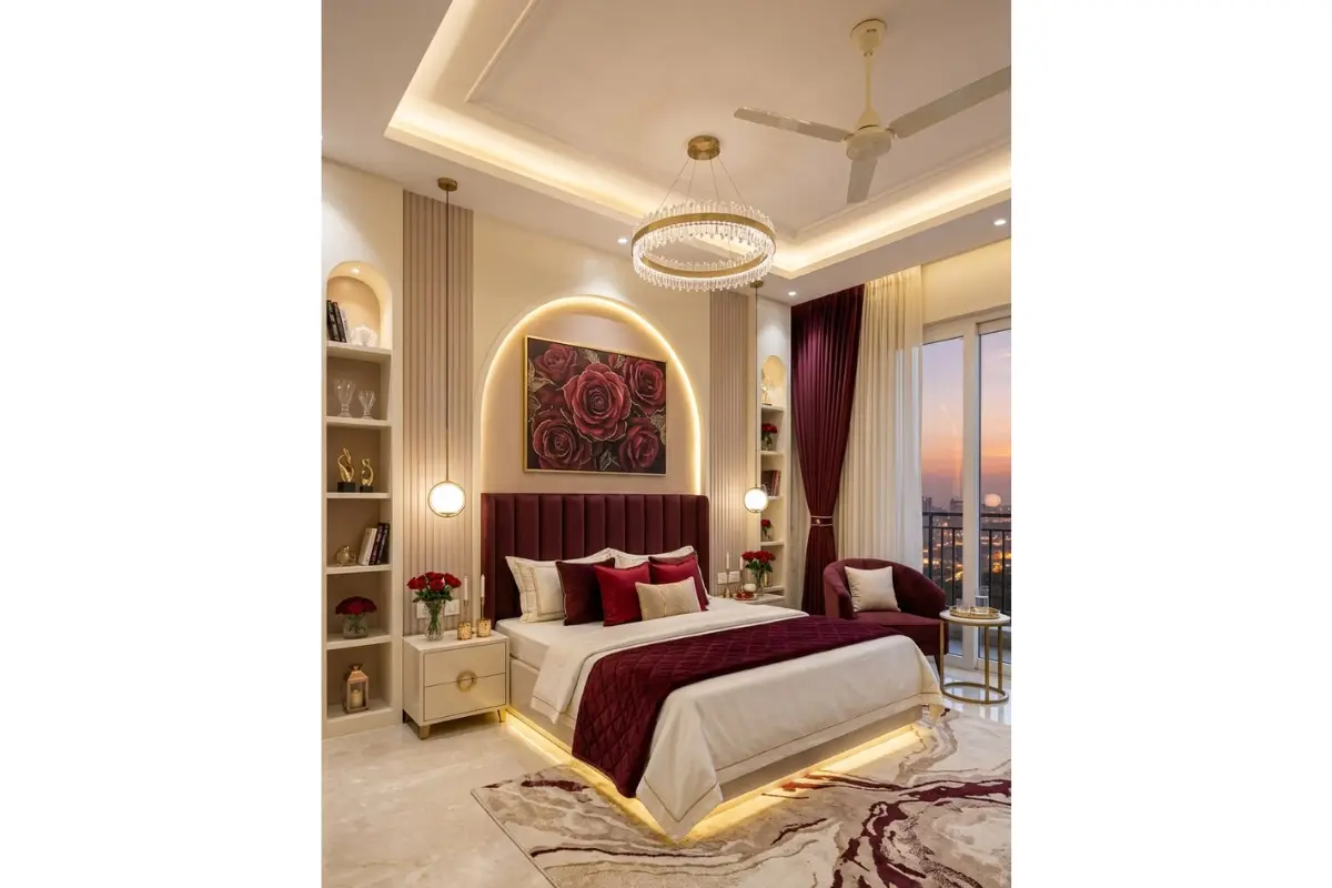
If you're after something with real festive energy, maroon or deep wine red paired with gold is about as classic an Indian combination as they come, especially in formal living rooms, dining spaces, and pooja rooms.
Gold + Blush Pink or Dusty Rose
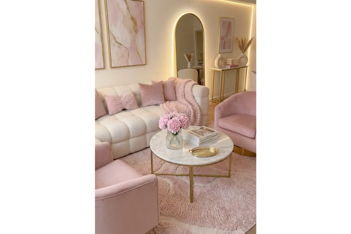
Softer, more romantic take — particularly popular in bedrooms and dressing areas lately — blush pink or dusty rose against gold gives a gentle, almost delicate feel.
Gold + Teal
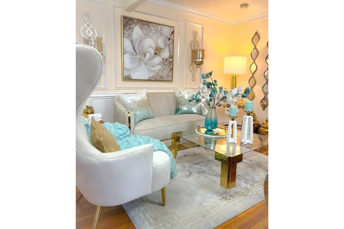
If you want something a little more unexpected and contemporary, teal alongside gold is a bolder pairing that's been gaining a lot of interest from homeowners who want to stand out a bit.
Each of these deserves a closer look, because the “right” gold matching colour genuinely does depend on which room you're decorating, how much natural light it gets, and what mood you're going for. Let's break it down room by room.
Golden Colour Combination for Walls
This is, by far, the question we hear the most — people typing “golden colour combination for wall” into Google at 1 in the morning, trying to decide before their painter arrives the next day. A full golden accent wall can genuinely transform a room, but the colour you place next to it is what decides whether the final result feels luxurious or overwhelming.
For a Calm, Sophisticated Look
Pair a matte gold or ochre wall with soft white, warm grey, or a muted sage green on the surrounding walls. This lets the gold act as the hero of the room without tipping the whole space into “too much.” It's a combination that ages well — you won't feel like repainting it in eighteen months.
For a Bolder, Statement Look
Combine a golden wall with deep navy blue or emerald green furnishings and drapery. This has been one of the strongest trends we've seen through 2026, largely because it echoes the jewel-tone palettes that top interior designers have been recommending all year — rich, saturated colours layered against warm metallic accents. It's a combination that photographs extremely well and makes a strong impression on guests.
If You're Not Ready to Commit
A tip we give almost every client who's on the fence: try a golden colour combination through trim, moulding, or a textured gold-leaf wallpaper panel instead of painting an entire wall. You get the same visual richness with far less commitment, and it's much easier and cheaper to change later if your taste evolves.
Matte vs. Metallic vs. Textured Gold
Not all “gold” paint behaves the same way, and this is where a lot of DIY attempts go wrong. Matte gold (closer to ochre or mustard) reads as warm and grounded and works beautifully as a full-wall colour. Metallic or pearl-finish gold has genuine shimmer and is best used on a single feature wall or in smaller doses — an entire room in metallic gold paint can start to feel like a showroom rather than a home. Textured finishes, like a gold-flecked plaster or a gold-leaf wallpaper, sit somewhere in between and are a favourite for pooja rooms, entryways and dining feature walls.
Golden Colour Combination for Living Rooms
The living room is usually where clients feel most comfortable being a little adventurous with gold, since it’s a space meant to impress guests as much as it’s meant for everyday living.
Golden accents work exceptionally well here through furniture and fixtures rather than paint alone — a gold-rimmed coffee table, a brass-finished console, a statement chandelier, or metallic trim along a sofa — set against walls in navy, emerald, charcoal, or a warm off-white. One trend we’re seeing a lot of right now is mixing gold with another metal, such as aged brass or matte black hardware; it gives the room a “collected over time” feel rather than looking like every piece was bought from the same matching set in one afternoon.
If your living room gets strong natural light, you can afford a bolder golden colour combination, since sunlight will soften the intensity through the day. In living rooms that are darker or north-facing, we usually recommend keeping gold to accents and letting a lighter base colour (white, cream, or soft grey) do the heavy lifting on the walls.
Golden Colour Combination for Bedrooms
Bedroom gold wall paint colours need a gentler hand than a living room, simply because this is a space meant for rest, not for making a statement to guests.
- Gold + Beige or Warm Taupe — creates a hotel-suite kind of calm that pairs beautifully with wooden furniture and warm lighting.
- Gold + Dusty Pink or Blush — a soft, slightly romantic combination that’s become very popular for master bedrooms and dressing areas over the last year.
- Gold + Deep Grey — contemporary and restful, a favourite among clients who want their bedroom to feel current without being trend-chasing.
Our general advice for bedrooms specifically: use gold sparingly. A headboard panel, curtain trims, a mirror frame, or a pair of brushed-gold bedside lamps will usually do more for the room’s atmosphere than an entire wall of gold paint. It keeps the space feeling peaceful and easy to fall asleep in, while still giving you that warm, slightly indulgent touch that gold is known for.
Golden Colour Combination for Kitchens
Gold in the kitchen is less about walls and much more about hardware and finishes — cabinet handles, tap fittings, pendant lighting, and even the trim on modular kitchen shutters. A brushed or antique gold finish against white, cream, or sage-green cabinetry has become one of the most requested modular kitchen looks we design, largely because it feels upscale without needing a full colour overhaul. For darker, moodier kitchens (charcoal or deep green cabinetry), gold hardware provides exactly the contrast needed to keep the space from feeling too heavy.
ALSO READ : Kitchen Colour as Per Vastu
Golden Colour Combination for Bathrooms
A bathroom is one of the easiest places to introduce gold without any real risk, because you’re rarely painting an entire golden wall — you’re working with fixtures. Gold-finish taps, shower fittings, and mirror frames against white marble, soft grey tiles, or even a deep charcoal accent wall instantly make a bathroom feel like it belongs in a boutique hotel. If you do want a bolder look, black-and-gold mosaic tiling on a single wall is one of the most dramatic, well-reviewed combinations we’ve executed — it reads as premium rather than gaudy, as long as it’s contained to one feature area.
Golden Colour Combination for Pooja Rooms and Traditional Spaces
Gold has always had a natural home in Indian interiors, especially in the mandir or pooja room, where it’s traditionally associated with auspiciousness, warmth, and celebration. A golden colour combination with deep red, maroon, or white marble finishes remains a classic, dignified choice for this space — and it’s consistently one of the most requested looks in our modular mandir projects. For a more contemporary pooja room, pairing gold jaali (lattice) work with soft ivory or cream backgrounds gives a lighter, more minimal take on the same tradition.
Golden Colour Combination for Kids' Rooms
Gold isn’t typically the first colour people think of for a child’s room, but used carefully, it works beautifully — particularly star, moon, or geometric gold wall decals against a soft pastel base like powder blue, mint, or blush pink. It adds a touch of whimsy and sophistication without tipping into “baby” territory, which is especially useful if you want a room that will still feel appropriate as your child grows older.
Golden Colour Combination for Offices and Commercial Spaces
In commercial interiors — offices, showrooms, salons, and retail spaces — gold is almost always used to signal quality. Reception areas with a gold-and-black or gold-and-charcoal colour scheme create an immediate sense of premium branding, which is why we see this combination requested so often for showroom and jewellery-store interiors. In office cabins and meeting rooms, a more restrained gold-and-white or gold-and-navy palette tends to work better, keeping the space feeling professional rather than theatrical.
Golden Colour and Vaastu: What Indian Homeowners Should Know
For many of our clients, especially those decorating a new home, Vaastu compatibility is a real consideration — and gold happens to be one of the more favourably regarded colours in Vaastu Shastra. It’s associated with prosperity, positivity, and the fire and earth elements, and is considered especially suitable for the pooja room, the living room, and the main entrance. That said, Vaastu recommendations can vary by consultant and by the specific direction of a room, so if this matters to you, it’s worth discussing your floor plan with a Vaastu expert alongside your interior designer before finalising any golden colour combination for a specific room.
Budget-Friendly Ways to Add a Golden Colour Combination to Your Home
Not every golden colour combination requires repainting an entire room or investing in new furniture. If you’re working with a limited budget, here are the entry points we recommend to clients most often:
- Gold-finish cushion covers, throws, or curtain tiebacks — an easy, reversible way to test whether you actually like gold in a room before committing further.
- A single gold-framed mirror or piece of wall art, which can instantly lift a plain wall.
- Swapping cabinet or drawer handles for brushed gold or antique brass — one of the highest-impact, lowest-cost upgrades we recommend for kitchens and wardrobes.
- Metallic gold spray paint on old picture frames, vases, or small furniture pieces for a DIY refresh.
- Removable gold-accented wallpaper or wall decals for renters or anyone not ready for a permanent change.
- A statement gold pendant light or table lamp, which adds warmth to a room even when it’s switched off.
Common Mistakes to Avoid With Golden Colour Combinations
- Using too many gold tones in one room — bright polished gold and muted antique gold don’t always sit comfortably together. Pick one finish and stay consistent throughout the space.
- Pairing gold with very cool, stark colours — icy blues or pure whites with a blue undertone can make gold look slightly dull rather than warm and inviting.
- Overdoing metallic finishes — one dominant gold element per room — a wall, a light fixture, or the furniture, not all three at once — usually looks more expensive, not less.
- Ignoring your lighting — gold changes character dramatically under warm versus cool lighting, and even more so between daylight and evening bulbs. Always check a sample swatch on your actual wall, at different times of day, before finalising anything.
- Skipping the sample stage — a colour on a small paint chip almost never looks the way it will across an entire wall. Get a sample pot and paint a large test patch before you commit.
Golden Colour Combinations Trending Right Now
If you’ve been noticing gold everywhere in interior design content lately, you’re not imagining it. Ochre and warm golden-yellow tones have been named an “alternative colour of the year” by several interior designers, prized for feeling grounded and livable rather than like a passing fad. At the same time, gold is increasingly being paired with rich, saturated colours — deep teal, emerald, wine, and charcoal — instead of being treated as a stand-alone statement colour on its own. Mixed-metal styling, where gold sits alongside aged brass or patinaed silver rather than matching perfectly, is also having a moment, giving rooms a more personal, gathered-over-time feel rather than a showroom finish.
How Can SKF Contractor Help You?
Reading about the perfect golden colour combination on a screen is one thing — seeing exactly how it will look on your own walls, under your own lighting, next to your own furniture, is another matter entirely. That’s precisely where SKF Contractor comes in. As one of Delhi’s most trusted interior design firms since 1992, we’ve helped hundreds of homeowners across Delhi NCR — from Civil Lines to Jasola to Vasundhara — bring golden accents into their homes in a way that feels personal and considered, rather than copied straight off the internet.
Whether you’re picturing a warm golden feature wall in your living room, a subtle gold-and-beige bedroom, a modular kitchen with brushed-gold hardware, or a traditional golden mandir space, our design team works with you from the very first mood board through to the final coat of paint. We use realistic 2D and 3D visualisations so you can see exactly how your chosen golden colour combination will look in your actual home, at your actual scale, before a single brush touches the wall — which means no surprises, and no repainting six months later because it didn’t turn out the way you imagined.
If you’re ready to turn this guide into an actual room in your home, get in touch with SKF Contractor for a free design consultation. We’ll help you find the golden colour combination that’s genuinely right for your space, your light, and the way you actually live — not just whatever happens to be trending this month.
Frequently Asked Questions