7 Gold Colour Combinations for Home Decor: Best Pairings for Indian Homes (2026 Guide)
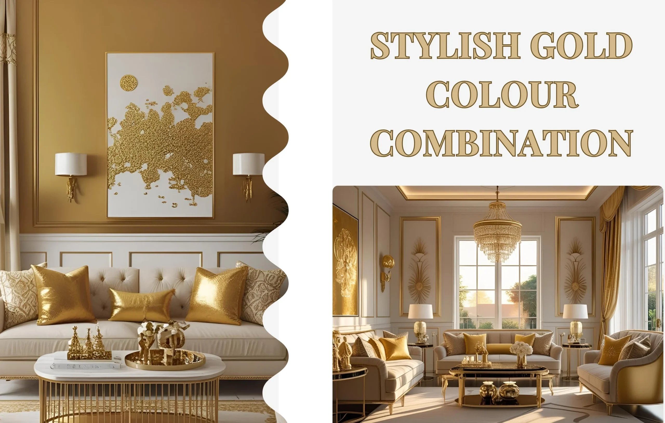
Gold has a way of giving a space a sense of completion. A single gold mirror can enhance a living room more effectively than an entire feature wall executed poorly, so the quantity of gold used is not of primary importance. Knowing which colors go well with gold and where to use them is the secret. When you do that well, gold appears pricey without being so. A space can appear outdated in as little as a year if you make a mistake.
Whether you're planning a complete interior makeover or just want to add a few gold elements that truly deserve their place, these seven gold color combinations for home design constantly work. Each one includes where to apply it, how much to use, and what to avoid.
1. Gold and White — The One That Never Fails
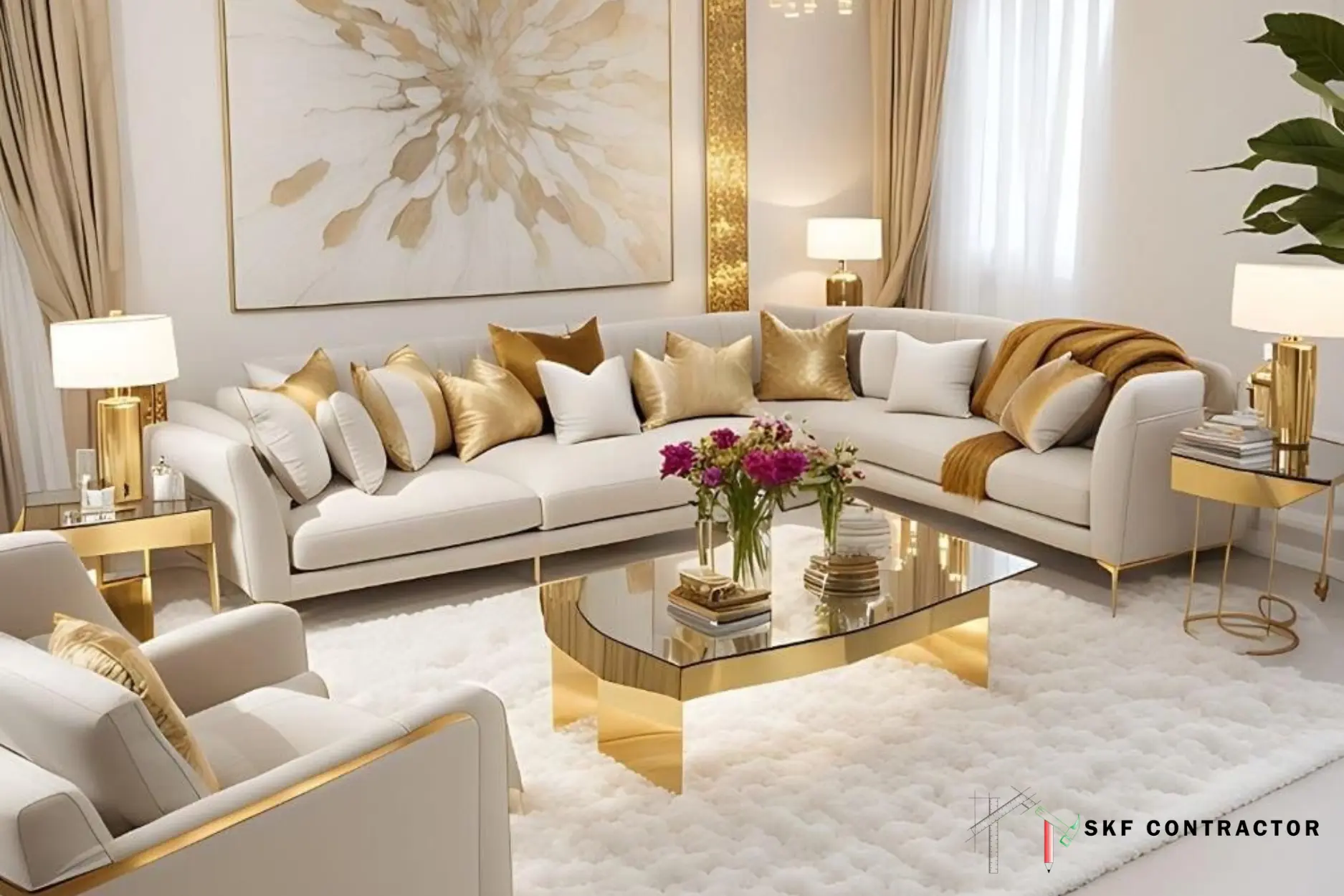
Almost every designer begins with gold and white because it's the safest and most adaptable combination on this list. White keeps the area seeming open and bright, while gold adds just enough warmth that the space doesn't appear chilly or clinical. It can be used in a master bedroom, living room, or even a little bathroom where visual clutter is prohibitive.
Consider white walls with a gold-framed mirror, brushed gold cabinet handles, or a single gold pendant light above a white dining table. Keep the gold to two or three touchpoints in the room—anything more and it starts competing with itself instead of the white.
2. Gold and Navy Blue — Confident Without Trying Too Hard
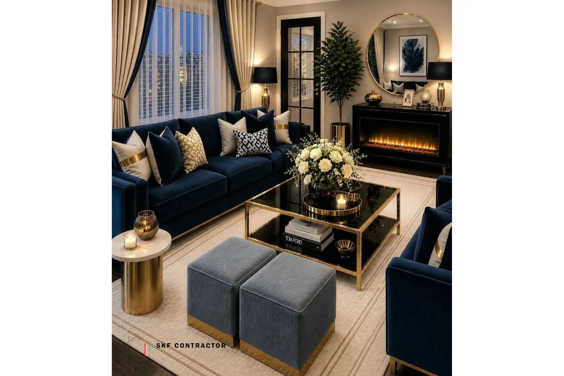
Navy and gold sit nearly opposite one another on the colour wheel, which is why they are such good friends. Navy adds depth, gold adds light, and the contrast reads as 'put together' vs 'loud.' This is a wonderful option for a study or a formal dining room or a living room that has a lot of natural lighting to offset the weight of the navy.
Try this: a blue accent wall behind a gold-framed console or navy upholstery with gold piping on the cushions. Not ready to dive into navy walls? Start with navy curtains and gold curtain rods.
3. Gold and Black — For When You Want the Room to Make a Statement
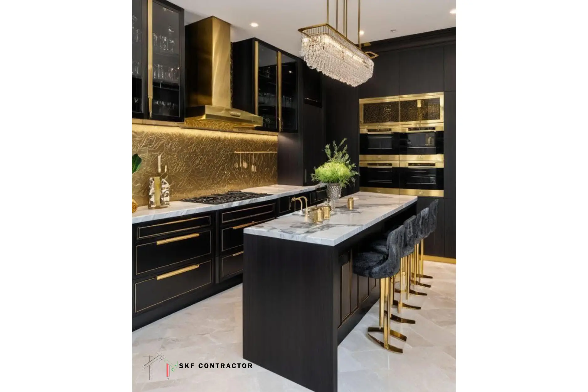
Black and gold is a bold combo that works effectively in the right space. Consider powder rooms, a feature wall in the dining room, or a home bar. Black absorbs light and provides gold something to shine against, so this juxtaposition photographs so well and reads as expensive even in a small room.
Try this: matte black walls with a gold chandelier or black cabinetry with gold hardware in the kitchen. Balance is key here—couple the dark with warm lighting so the room doesn't feel too heavy or boxed in.
4. Gold and Emerald Green — Rich, Natural, Not Overdone
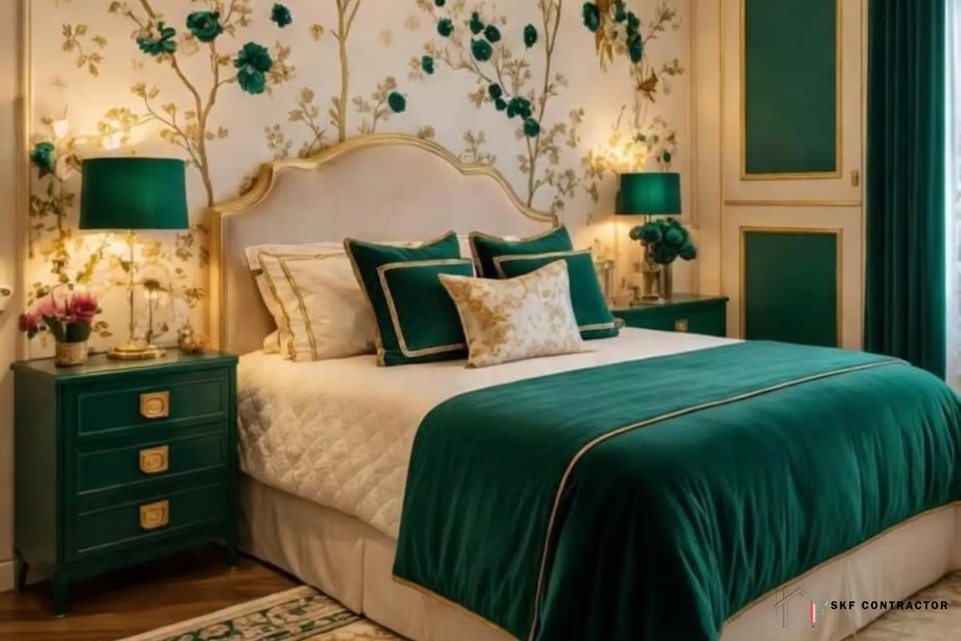
Green and gold have the same warm undertone, which is why this combination feels natural rather than forced—it's the palette underlying a lot of botanical and Art Deco interiors for good reason. Emerald green velvet with gold trim is really having a moment in living rooms and bedrooms right now and tends to age nicely, as it isn’t bound to a passing trend.
Try these combinations: an emerald velvet sofa with a gold coffee table or deep green kitchen cabinetry with brass hardware and white marble counters to avoid it feeling too dark.
5. Gold and Grey — Modern, Calm, Easy to Live With
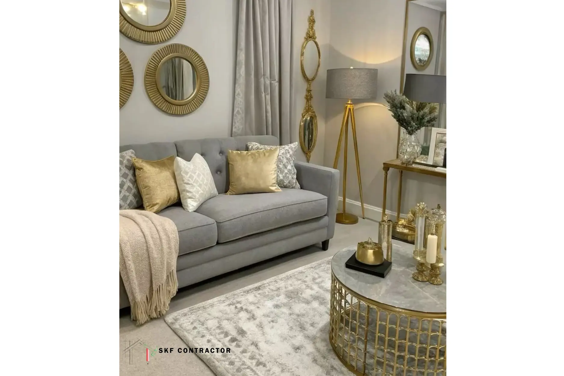
If white and gold are too brilliant and black and gold too bold, grey and gold rest comfortably in the middle. It’s the combo most people opt for when they want a contemporary design that won’t seem cluttered day-to-day—a fantastic fit for bedrooms, home offices, and open-plan living spaces where you spend a lot of time.
Try this: charcoal grey sofas with side tables that have gold legs or a light grey accent wall with a piece of artwork in a gold frame. This combo also provides better coverage against daily wear than pure white; it also offers superior coverage against daily wear compared to pure white, making it essential for heavily used areas. for spaces that are heavily used. This combination is especially effective in heavily used spaces.
6. Gold and Warm Wood Tones — Grounded and Welcoming
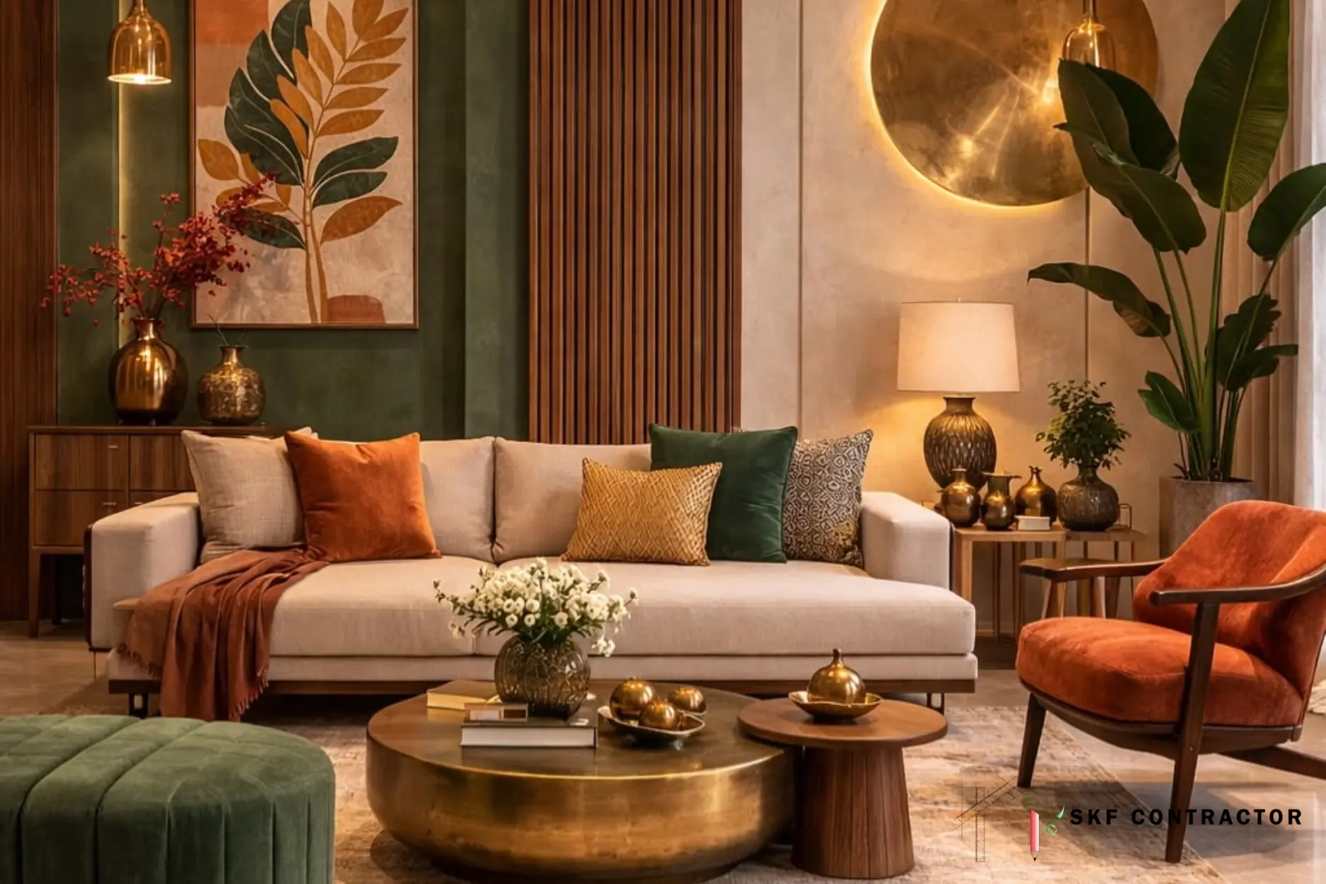
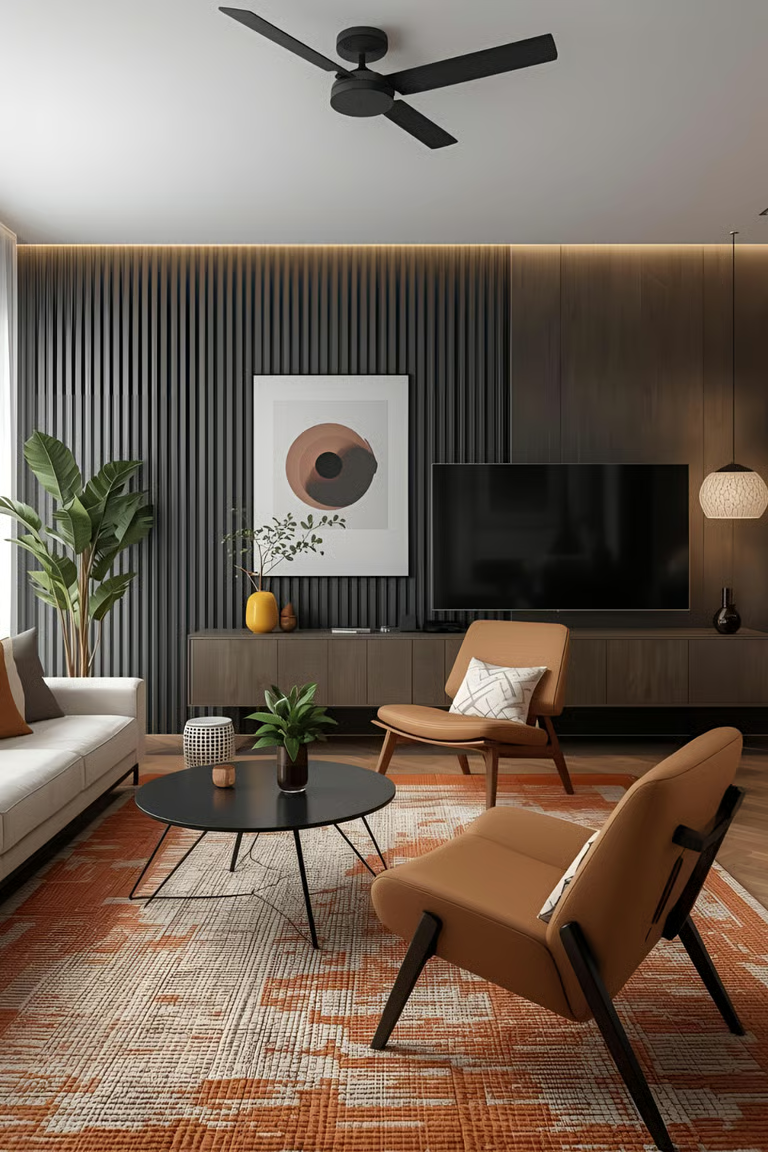
Not all gold pairings have to be a paint colour – wood counts too. Nothing says "grounded, welcoming environment" like warm walnut or teak furniture with gold inlays or hardware. Pure white or black just can't compete. This style works really well in Indian houses, as the backbone of most living rooms and bedrooms already consists of wooden furniture.
What about this option: a wooden bed frame with gold-trimmed side tables. Alternatively, consider a wooden TV set that features slim gold accent strips. This option is also one of the more cost-effective methods to introduce gold into a room because it works with furnishings you likely already own.
7. Gold and Blush Pink — Soft Without Being Fussy
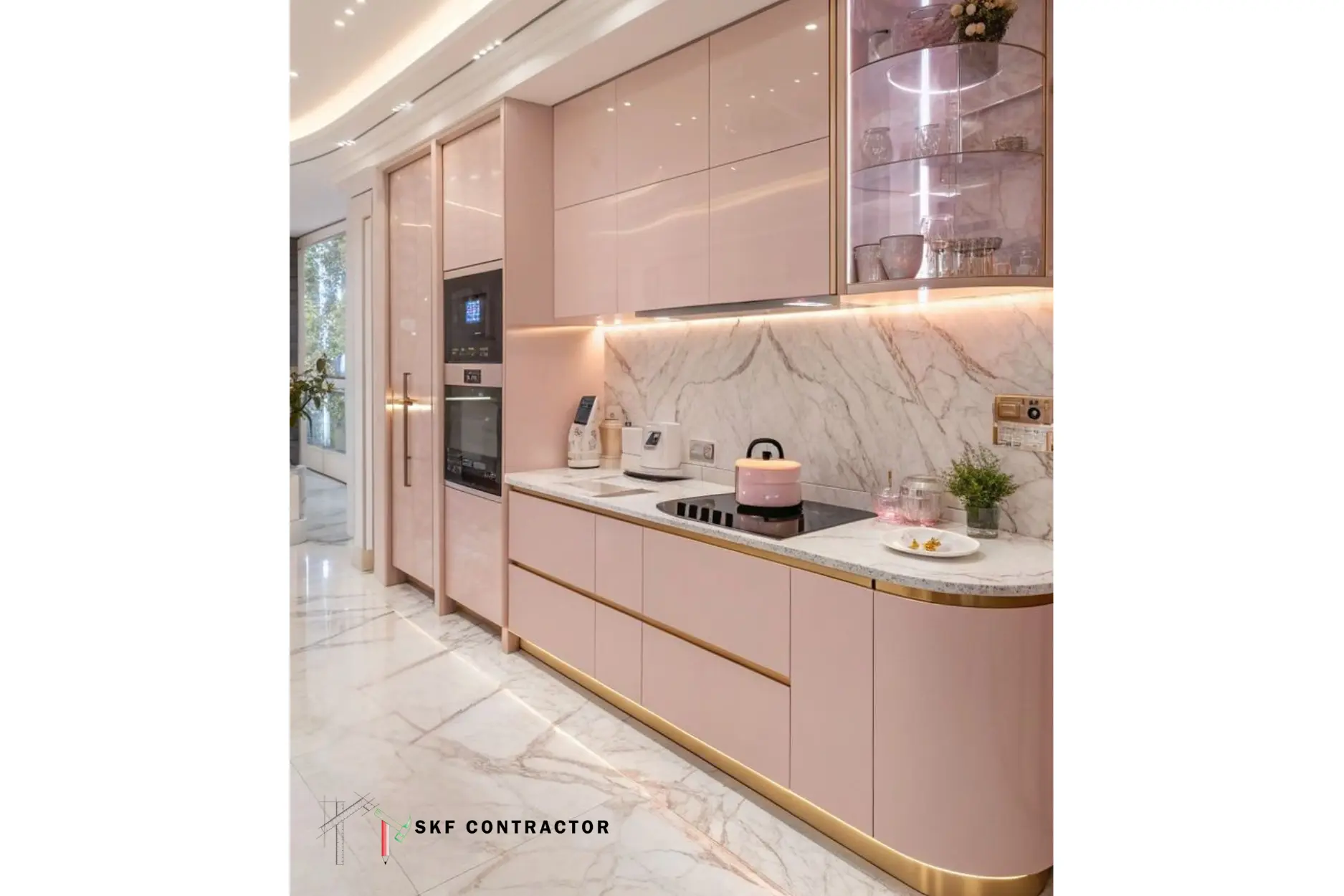
Blush pink and gold is a more subtle take on glamour—it's soft and warm rather than dramatic, so it works for bedrooms, dressing spaces, or a feminine home office. Pink alone can feel overly sweet; gold anchors it and pulls the whole palette toward elegant rather than sugary.
Consider this: a blush accent wall with a gold-framed mirror or pink velvet cushions with gold trim on a neutral sofa. Pair it with a darker neutral, such as charcoal or deep brown, to avoid a monotonous feel in the room.
How Much Gold Is Too Much?
This is the question that baffles people more than the question of which hue to wear with gold. A simple concept that works in virtually any room: let your base colour (walls, major furniture) be about 60% of the area, your secondary colour (upholstery, curtains) be 30%, and let gold take up the remaining 10% as an accent—hardware, frames, lighting, and little furniture legs. Go much beyond that and gold ceases to look like an intended effect and starts to look like it has taken over the room.
It is also advisable to select a single gold finish and maintain its consistency within a single room. Polished brass, antique gold, and rose gold all look slightly different, and blending two or more finishes in the same area can make it look unplanned rather than curated.